Spezia Calcio today unveils its new visual identity, the result of a creative journey shared with its supporters and developed in collaboration with Tub Design. This project aims to give life to a symbol that reflects the values, history, roots, passion, and deep sense of belonging of the Aquilotti faithful.
The new logo, which will come into use starting from the 2025/2026 season, draws strong inspiration from the Club’s origins and fully embraces the proud sporting tradition of the Aquile, one that has been passed down from generation to generation and has warmed the hearts of an entire city for nearly 119 years.
This new visual identity takes its cue from the past and, through a modern reinterpretation, casts a forward, looking gaze toward the present and future of the Club. The final result is a design that captures and enhances the spirit of Spezia Calcio and its entire community, ideally allowing every supporter to immediately feel at home in their sporting identity.
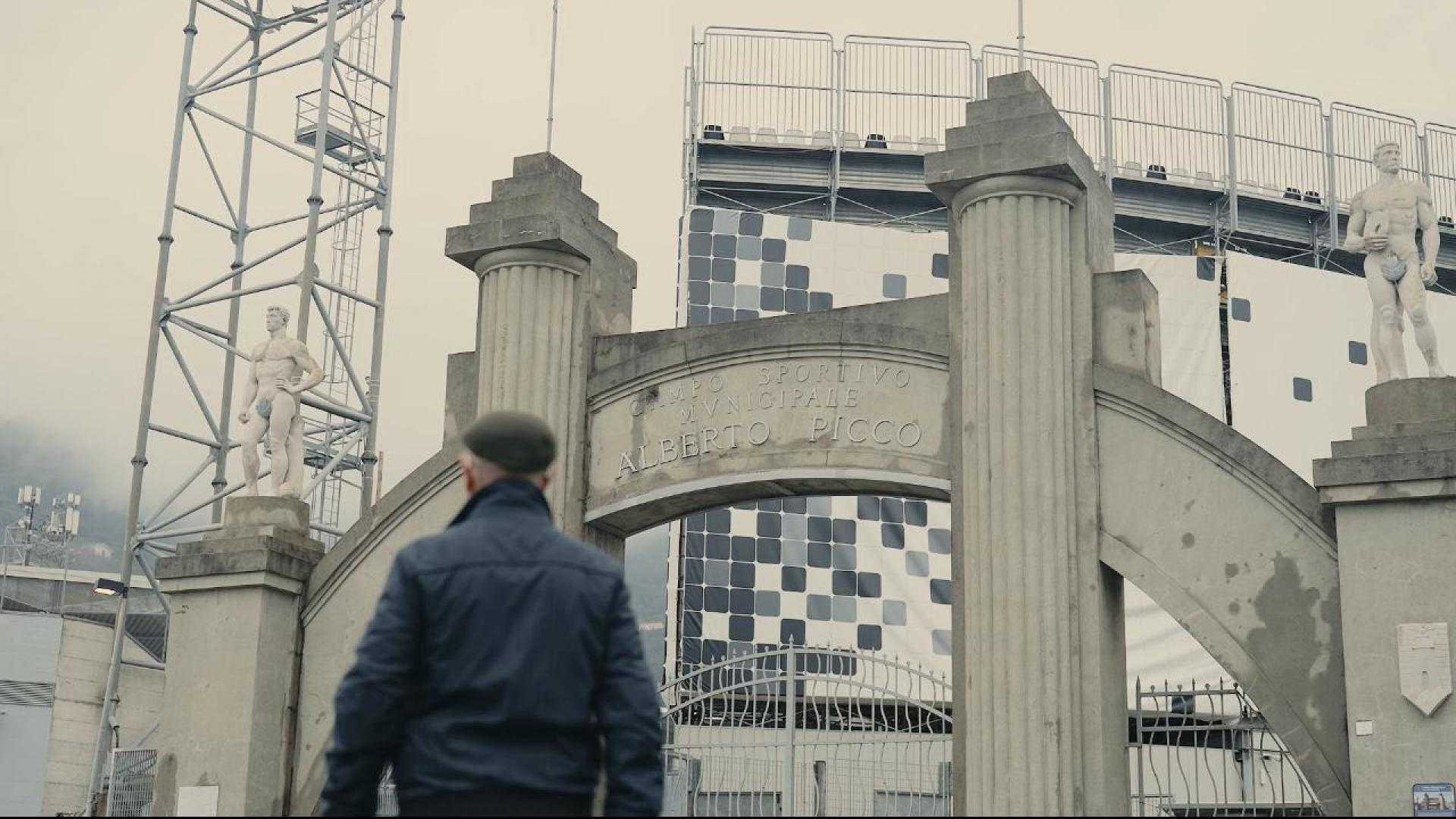
The narrative accompanying this launch, centered around the slogan “The future lies in our roots,” takes us on an emotional journey into the heart of La Spezia, seen through the dreaming eyes of an elderly, lifelong fan whose greatest wish is to pass down his love for the white jersey and his hometown to his young grandson, a future to nurture with tenderness and passion, always grounded in the strength of one’s roots.
The path to redesigning the official Spezia Calcio logo was as unique as it was meaningful. Supporters played a central role in all three phases of the creative process, which began last summer with an Online Form where thousands of fans shared their thoughts and suggestions. It continued with the creation of randomly selected Focus Groups, where the drafts produced by Emanuele Martera and his team at Tub Design were the subject of open and sincere discussion, a vital step in identifying the finalist logos and ensuring that the values, history, and roots of the Club were truly reflected in the new proposals. The third and final phase once again placed supporters at the center, with a public vote on the official website, www.speziacalcio.com, ultimately deciding the winning design among the shortlisted finalists.
The redesign of Spezia Calcio’s logo begins with the decision to incorporate the letters S and C (Spezia Calcio), faithfully redrawn using the typography of the Club’s traditional emblem. Two intertwined letters, enclosed within a circle, so iconic and distinctive that no additional graphic elements were needed. The entire composition is set within the shield used in 1944, with proportions carefully recalibrated to meet modern graphic standards while preserving its historical identity. Adjustments to thickness, curvature, alignment, symmetry, and structure ultimately shaped the visual harmony of the final design.
The new logo was created in vector format to ensure maximum adaptability and consistency across all platforms, from digital to print. A single black-and-white color version has been chosen to emphasize the essential nature, sobriety, and strong visual identity of the Club.
“The path we chose to take in creating this new and definitive logo was by no means obvious or simple. But we were determined to embrace our fans and our history, and we embarked on it with conviction and enthusiasm. A Club’s logo represents not only the identity of a team, but of an entire community. It tells a story. It stands for pride. It reflects our roots, our present, and our future. In short, it embodies a passion meant to be passed down from one generation to the next. I want to take this opportunity to thank all our supporters for their exceptional participation, Tub Design for the outstanding work, and everyone who contributed to this journey of dialogue and shared purpose, something rarely seen in Italian football at this level” said Andrea Gazzoli, CEO of Spezia Calcio.
“One key word guided this project from the beginning: belonging. We looked to the past in order to move forward, rediscovering our history to shape our future. Every detail tells the story of who we’ve always been and who we want to continue to be. It’s a meeting point between past and future, between memory and vision,a rediscovery of what makes us unique. This isn’t just a new logo. It’s a return home” said Emanuele Martera of Tub Design.
The current logo will remain in use on official jerseys until the end of the current season, after which it will be replaced across all lines starting July 1, 2025.


Cookie per Social Networks
Si tratta dei cookie che consentono di condividere anche con altri utenti i contenuti del sito che si sta visitando. Sono i cookie tipicamente utilizzati per attivare le funzioni “Mi piace” o “Segui” dei Social Network quali Facebook e Twitter, solo per citarne alcuni. Queste funzioni consentono ai Social Network di identificare i propri utenti e raccogliere informazioni anche mentre navigano su altri siti.